With a lot of people entering the Sublimation craze, there seems to be quite the misunderstanding of lack of understanding of the roll that RESOLUTION plays in in printing.
Resolution is expressed in Dots per Inch. The higher the number the higher the resolution and the clearer the print will be (up to a point – most printer print 300 dpi). So if your design is the size you want to print it, at 300 dpi, it will print the way you want it.
For the most part you can’t increase the DPI (there are some programs like the newest Photoshop which can use predictive AI to fill in some pixels and double it). If you start with a small image and enlarge it, you don’t add pixels, you stretch them out, making them larger and your picture less clear.
You can, however, shrink an image and not lose resolution. So it’s always better to start with the highest resolution possible.
The examples below use actual images for which I have purchased commercial rights.
- Screen Shot – looks great want to put this on a shirt. Copied it from a website and even managed to remove the background!!
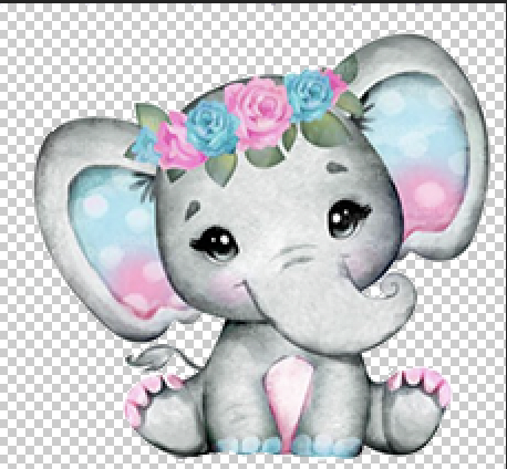
The problem is the image is approx 3×3 with a resolution of 72 DPI. So I make it the 10×10 image. It still looks great on the screen.
UhOH!!! Why is my print blurry, it looks great on the screen. Because this is the actual size now. Resolution is 19 DPI after enlarging it.
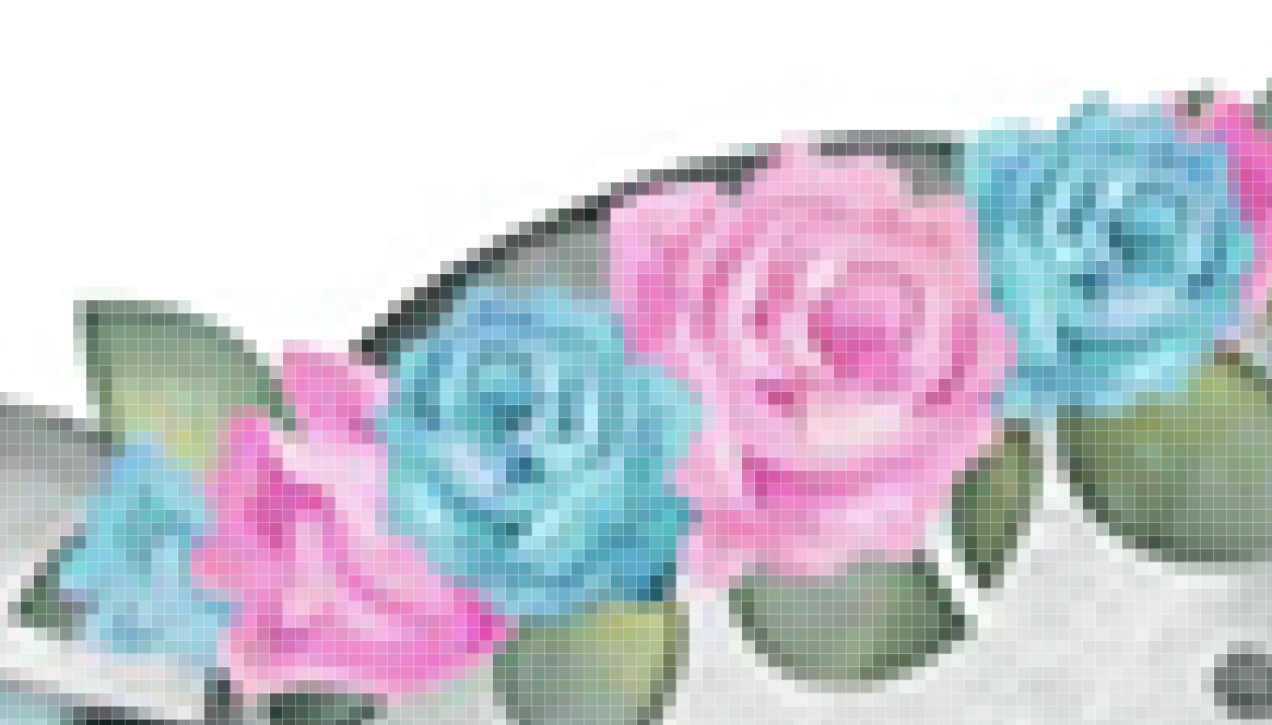
Now here is the actual print after downloading from the website and I don’t even have to remove the background myself


 Select each line – its easier if you make them slightly longer than your design. Right click and make them a compound path. If you have a lot of text, move the text off the mat, select all the lines and make a compound path, and move the text back on

