My Design Won’t Cut!

Why won’t my design cut? It says, “cutting, and then, “finished,” and nothing happened. This can be very frustrating. I know this; I speak from experience.Screenshot 2015-07-08 12.44.47

The first thing to check is that your cutting lines are actually on. Do this by going to blade on the top right and checking the settings. It should look like this. The next thing to check is that you’re USB cord is connected at both ends. Screenshot 2015-07-08 12.54.05

After that if it’s still not cutting, chances are you have a problem with off-the-mat objects. You may not even be able to see them. Sometimes they are empty text boxes, but they are still there.

The fact that it says, “cutting,” even when it doesn’t means that your connection it good. Now it’s time to really examine that design of yours and determine where all the elements are.

To do this use CTL-A or CMD-A (Mac) to select the entire design. If your bounding box looks anything like this, you have items off the page that are either grouped of part of a compound path.Screenshot 2015-07-08 12.45.57Simply ungroup them or release the compound path and you should be good to go.

Yana – The New Laura Worthington Font

YANA is the new font by Laura Worthington and is available at Mighty Deals for a limited time for $15. Using the Coupon Code CSS-TRICKS will get you 10% off.

This font is PUA coded to use in applications like Silhouette Studio, etc. You don’t need to use Adobe Illustrator or Corel Draw to access the fonts. If you’re not sure how to use PUA fonts, check this out WINDOWS or MAC.

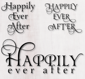
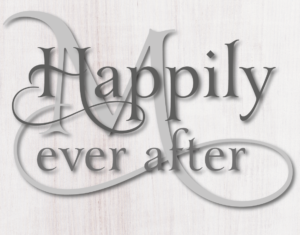
At first I was a little disappointed that there weren’t alternatives for lower cases, just upper cases. But, as I was playing I realized that sometimes less is more and that the lower case letters were quite elegant in their own right. Check out some of the screenshots below:

Screenshot 2016-08-05 11.00.41

Screenshot 2016-08-05 11.40.11

And plain lower case looks great combined with other fancy scripts. Here it is with Samantha.

Screenshot 2016-08-05 11.47.37

Filling a Shape with Patterns – Patterned Pumpkin

It’s been a long time since I’ve updated, but I am going to be adding some of tutorials that have been posted on Facebook.

The first one is for a patterned pumpkin. If you learn how to do this, you can apply it many other other creations – how about a patterned Christmas tree?

There are a lot of steps to this and it requires some basic knowledge such as grouping, welding, offsetting and creating compound paths.

There is a link to a PDF at the bottom.

Here Goes:

Screenshot 2015-09-28 11.58.51

Screenshot 2015-09-28 12.01.53

Screenshot 2015-09-28 12.02.13

Screenshot 2015-09-28 12.02.32

Screenshot 2015-09-28 12.02.51

Screenshot 2015-09-28 12.03.04

Screenshot 2015-09-28 12.03.18

Fancy pumkin direction

How to Make Wavy Text in Studio

While it’s easier to create wavy text in programs such as Illustrator, it’s not difficult to do it in Silhouette. Now, I don’t have Basic on any of my computers, so I’m not sure if this is just something that is available in the Designer Edition.

The first thing to want to do is create the path for the text. For this, I use the Smooth Draw tool.

Using this tool, drag out a wavy line – the tool automatically smoothes for you. I turned up the point size so you can see it. You won’t do that. You can manipulate it even more by selecting the point edit tool and playing with the handles.

Once you have it exactly the way you want it, duplicate it if you will want several rows of text. An easy way to to this is to hold down the ALT button and drag.

Now, type your first line of text and drag it to the path.


When you are done, you may find that you have to play with the spacing. It may be necessary to ungroup and place a few letters differently. If you make your curves gentle, you won’t.

NOW GO PLAY!

Samantha Upright Step by Step

So, I tried to do a recording and it didn’t work out. This may be better any way since you don’t have to rewind.

  1. Open Studio and type a word – I used Bride.


  1. I want to change the B to a fancy B. I use a Mac so I opened Fontbook and copied the B I wanted. If you are on a PC, you can use Nexus Font or the Windows Character Map.


  2. I then pasted the fancy B into the word in the Studio program. Very pretty as is, but let’s work on it some.


  3. Here’s where the fun begins.

    Highlight your word. Look at the tool bar on top of the screen for the shape that looks like a parallelogram and click on that. That is the sheer tool. Pick 15% and this is what happens.

    Screenshot 2015-06-03 12.01.00


  4. Now, with the word still highlighted, go to the offset button and set your offset at either 0.02 or 0.03. I use 0.02 for small text and 0.03 for larger text. Move the original text from the offset text. 


This may have been closer with a 0.02 offset for the bold. The problem with that is that it left a hole in “i”. I could have manipulated that, but I thought it looked pretty good just the way it was.
Again, if you benefit from my postings and decide to purchase the font, I would apprciate it if you would use my link so I can get credit to buy more fonts to play with!

For MAC users:

To open font book go to the top of the computer screen on the left and click the magnifying glass.Screenshot 2015-07-19 15.59.16

In the box that opens, type Font Book. When Font Book opens, locate Samantha.

In thScreenshot 2015-07-19 16.02.14e View menu make sure Repertoire is checked.

You should then be able to see the glyphs in the panel.

Screenshot 2015-07-19 16.05.55

Talking Software Today

Let’s talk software! I am, by any stretch of the imagination, an expert. But I’m going to write about some of my experiences. I’ve used Adobe Illustrator, Corel Draw, Silhouette DE, Sure Cuts a Lot  (SCAL) (since version 1) and Make the Cut (MTC).

Adobe Illustrator and Corel Draw are great if you like to do your own designing. You can access the alternate characters in fonts like Samantha directly. I happen to think that Corel does this better than Adobe, but that’s just a personal preference.  SCAL offers a free plug in to send your Adobe or Corel designs to SCAL. SCAL PRO allows you open Adobe files directly, but  you have to convert text to outlines first. There is also Inkscape, which is a free program. I don’t know much about it because I have the other two, but there are plenty of online tutorials. It does not access the extra glyphs in fonts.

Silhouette offers several options.

First is Silhouette Basic. This is the freebie program. You can use files you buy from the Silhouette store. Sometimes you’ll find people selling .studio format files, but if Silhouette catches them, they will shut them down. You can also use DFX format files. Designers who design in Illustrator, Inkscape, or Corel can furnish these.

Silhouette also offers Silhouette Designer Edition. They charge $49.99, but you can get it from SVGCUTS or Amazon for a lot less. There are some features such as rhinestone setting, nesting, rules, but the greatest one is the ability to use SVGs. Silhouette will be offering a DE PLUS edition. It seems that the purpose of this is to take features that should be in the DE version and charge extra for them. They also offer a Business Edition. My opinion is that it is a waste of money. The greatest feature is weeding lines, and you can really do that yourself. But that’s just my opinion. If you use it and want to add your 2¢, please leave a comment. I admit to not knowing much about it.

Silhouette also offers something called CONNECT which will allow you to cut directly from Adobe Illustrator and Corel Draw. They charge $40 for that. I would say if you only use Adobe or Corel, it might be worth it as it will save you a few seconds, but it seems a lot for a little to me.

(to be continued)

Blade Depth and Pressure

A lot of people have ventured into the world of cutting machines with very little understanding of what they are doing. It’s not their fault, the machine companies push the idea that all you have to do is to press a button. It’s simply not true.

I have a much easier time with vinyl than many people I see posting in Facebook groups. I think that’s because I started and worked with paper for many years. While working with paper, it was necessary to develop an understanding of blade depth and pressure (called thickness by Silhouette). By calling pressure “thickness” they confuse a lot of people, because thickness of the material you are cutting actually relates more to blade depth.

Hobby machines all come with click-type adjustable blades (if you have an old Silhouette or Wishblade, it came with colored caps to adjust the blade. With a click blade, the higher the number, the more the blade sticks out. You may have purchased a CB09 blade for the Silhouette. That’s a professional Graphtec blade and to use it you need to understand what the blade is supposed to do.

THE BLADE: Blade adjustment comes first, whether cutting vinyl or paper. The blade should be extending no further than very slightly more than the thickness of your material. Too far and it will cut the mat, not far enough and it won’t cut through. This is a lot less than you might think it is. Any other adjustments should be made with the pressure or the “thickness”. Most people have their blade out too far. It should be sticking out just less than the thickness of a credit card. Other adjustments are made in the pressure setting (thickness on the Silhouette)

Take a minute and watch this video: ADJUSTING THE BLADE FOR VINYL CUTTING

Cutting Paper: Lately, it seems a lot of people are trying to cut paper. Adjusting the blade to cut paper is much trickier. The settings recommended by your machine are for their brand of paper only, and of course, you want to use a variety of papers. Don’t we all? Again, you want the blade only slightly deeper than your paper – you don’t want it cutting way into your mat. Too deep, and you’ll ruin your mat and it may shred your paper. Too shallow, and it won’t cut through. To test your blade setting, try this:

Put your paper on a piece of cardboard. Run your blade across it using a slight amount of pressure. Did it cut through the paper and only slightly mar the cardboard? If so, it’s good. If not, dial up or down. To see what this would look like, check out this page from US Cutter.

PRESSURE, THICKNESS, DOWNWARD FORCE: This is how much force the machine puts on the blade when cutting. I don’t know why Silhouette calls it THICKNESS since that is not a good description. I originally thought it had to do with how thick the material is, but really, it doesn’t. The thickness of the material determines your blade depth. For this reason, I prefer the term PRESSURE

This setting is how much downward force is applied to the blade as it is cutting. At its highest setting (33) the Silhouette studio has 210 grams of force. To round things off, each number on their thickness settings is about 6 grams of force. Interestingly, Provocraft has refused to release the cutting force of the Cricut, but since it can cut heavier material than the Silhouette, I would assume it is slightly more, maybe 300 grams. Most vinyl manufacturers recommend starting at 40 grams of pressure and adjusting form there. That would be 8 or 9 on the Silhouette Cameo.

Cutting paper is much more difficult than cutting vinyl. There are so many kinds of paper with such different characteristics. Not all settings work for all paper. The thickness and density of the paper are important factors. You should do test cuts for paper and write your settings on a sample and file them away (if only I practiced what I preach). This picture is recollections cardstock at the standard settings. The circle is OK, the square has not quite crisp corners and the triangle is a major handing chad.

IMG_1243

I then backed the blade off from 4 to 3 and it was a bit better, but the triangle and square still had to be pushed out and the corners weren’t crisp.

Here’s the secret: It’s the overcut function. I set mine to 0.2mm. What this does is cause the blade to lift and move forward 0.2mm at the corners. Voila! Crisp cuts that released cleanly.

Screenshot 2015-05-29 14.40.09IMG_1249