SCAL-4 and DE Comparison

Today I want to do some comparisons between the DE version of Silhouette Studio and the Basic version of Sure Cuts a Lot 4 (SCAL). There are some differences and there are some things I think each does better, and being the software junkie I am, I have both. But if I had to choose, I’d go with SCAL. I also have SCAL 4 Pro so I’ll talk about that too. I don’t have Silhouette Business Edition. I have MTC (told you I was a software junkie) but I find it difficult to use and I don’t feel they’ve kept up with SCAL. Also I use a Mac as well as a PC and they don’t have a driver for the Mac.

This isn’t a comparison of all features. I just don’t have that much time. The features that I still use Studio DE for is the Sketch Pens and the Knives. I feel SCAL fell down on this. The most important feature in SCAL (to me) is the ability to export as SVG, PNG and JPG because it allows me to use it as a true design software. I sell my designs and (in my opinion) using Studio to do that yields inferior results. Unless you have version 2.0, you have to trace your image and all but the most simple images will not be as good as the original.

Studio DE SCAL Basic
Cost $49.99 (discounts available) $59.99 ($19.99 upgrade from any version)
Ruler Yes Yes
SVGs Yes Yes
.Studio Files Yes No
Shape Drawing Yes Yes
Additional Shapes No 285
Uses OTF/TTF Fonts Yes Yes
Access Within Program to Mapped Fonts Such as Samantha No Yes
Skew Shapes (for taking Upright Fonts to look Italic) Yes Yes
Eraser Yes Yes
Knife Yes (more options) Yes
Rhinestones Yes Yes (more options)
Wrapper Distort (for shaping designs to tumblers and glasses) No Yes
Type on a Path No (but can be moved to a path) Yes
Barrel Distort (see below) No Yes
Bulge Distort (see below) No Yes (many adjustments for unique shapes)
Canned Distort (see below) No Yes
Lattice (see Below) No Yes (many adjustments)
Sketch Fill

(see Below)

Yes (many options) No, but can be done in a limited way with Line Fill
Knockout No Yes, plus ability to create gap effects
Puzzle No Yes
Wave Distort No Yes (lots of adjustments)
Save as SVG, PNG, JPG No Yes
Trace Yes Yes (better – ability to trace by color)

Barrel Distort

Bulge Distorts


Canned Distort (adjustments available)

Lattice

Line Fill                     SKETCH

Wave Distort

How to Split Any Letter (or anything else)

Today’s post is about splitting a file. A lot of people like the look of split letters and there are files like the Regal Font, which are 100% free or like Apex that is in the public domain. So why do people buy these files already split – the there are two answers. The first is that they don’t realize how easy it is to do it themselves, and the other is that most of these files need some cleaning up. Some people clean them, some don’t, and you are left with an inferior cut file. There are hundreds of people selling the Regal Letters on Etsy and if you have MTC, Julie did a phenomenal job of splitting them and cleaning them up for cutting. Personally, I have been working on splitting and cleaning Apex Lake for 6 months and I’m about halfway through, but I test cut each file at least 3 times.

Before you begin, you should read about compound path and grouping in a previous post. It will help you understand some of these steps.

I am going to be using a Free for Personal Use font called Preciosa available on Dafont. I chose this one to demonstrate with because it has simple lines and doesn’t need cleaning up (getting rid of parts that won’t cut well because they are too small).


The first thing I want you to notice in this picture is that the bounding box is larger than my font. I see this question posted on FB a lot. How come my font is smaller than the size I set? The answer is because the font “size” as shown by the bounding box is the size of the largest letter in the font.


Decide where you want your letter split and how big a split you want and draw a rectangle that size. The width of your rectangle needs to be wider 
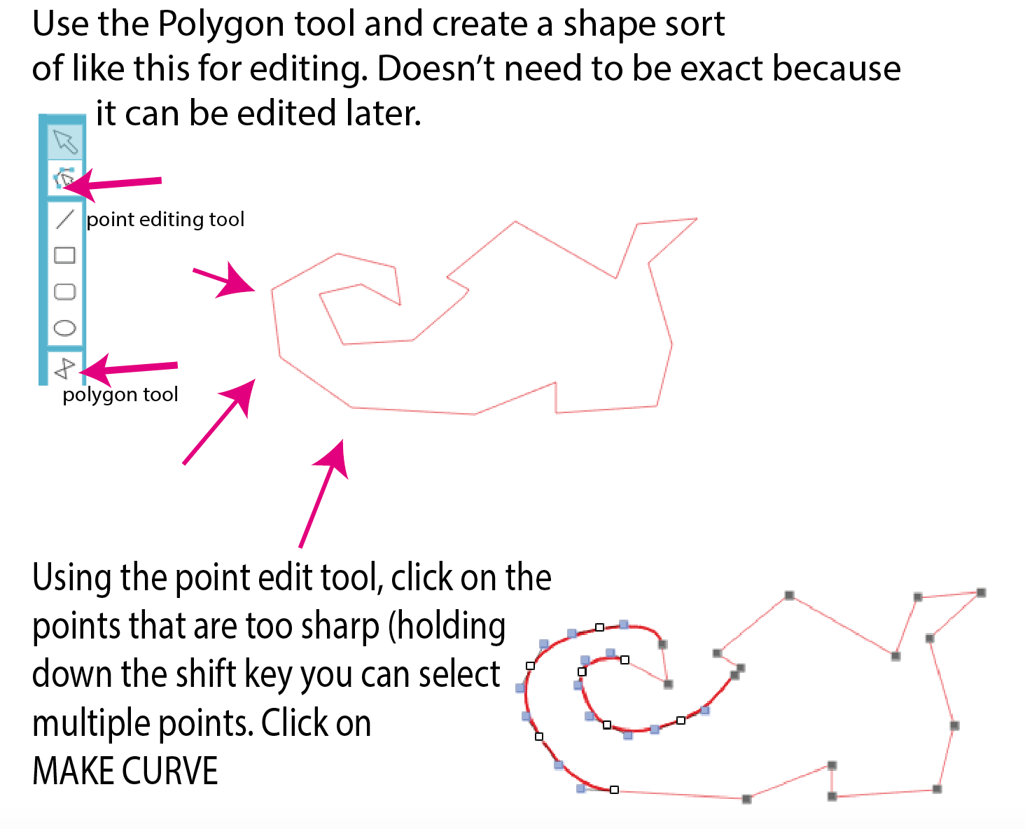
than your letter. I filled mine with color so you can see it, but it’s not necessary. The next step is to select everything, click on the WELD MENU (on the top button bar – it looks like a rectangle with an “m” on it.

And then select subtract. If using a complex font, this step could take a while and it could seem as if your computer is freezing. Walk away and have a cup of coffee (or a glass of wine).

You will end up with something that looks like this. This is where you might want to clean up some very tiny pieces. For the sake of appearance, I am going to group the top and then group the bottom.


You can leave it like this, but I like the little bars on mine, so now I am going to draw the bar for the top and place it where I want it on the top. It needs to overlap a tiny bit (notice that my partial circle is covered. No duplicate it and put the second one on the bottom aligned with the first. Check that you like the look and the alignment.


When all is good, SELECT ALL and then WELD. Then group everything together so you don’t accidently loose little pieces. Add whatever you want in the space and show off.


Here’s a free graphic on Pixabay that’s been split with the same method.

screenshot-2016-09-14-17-38-53


GO PLAY


Using Fonts With Gylphs

First, what is a GLYPH?

A glyph is what we call characters that are part of a font that is not a standard letter. This is where you will find the swirly fancy alternatives and often some extras like swirls and frames.

As crafters, we love the glyphs. It gives our work character and makes it unique.  Lots of fonts have glyphs BUT not all are available without expensive software such as Adobe Illustrator or Corel Draw. Adobe Photoshop CC also has the ability to use fonts with glyphs.

To take advantage of fonts without special software, look for fonts that are labeled “PUA” (Personal Use Access) or Access for All. All fonts on Fontbundles are coded so you can buy with confidence. On other sites, be sure to read the descriptions.

To insert the glyphs into your text, follow the directions on the links along the top of this page for Samantha. They all work the same way. Any program that accepts glyphs will work with those directions.

Some font designer will accommodate people who don’t have special software by making the extras into separate fonts. You will need to switch between fonts.

Also if you have Sure Cuts a Lot 4, you can access the glyphs directly from your font library.

Legs, Legs, Legs (Witches and Elves)

Stop tracing and start making! These directions are for Silhouette Studio but are basically the same for Adobe Illustrator and SCAL-4.

Let’s make these. Notice that the difference between Witch and Elf is the color of the stockings and the bell on the Elf’s shoe.

screenshot-2016-09-12-09-50-23

You start with your polygon tool and draw approximately what you want the shoe to look like and work from there.   Click here to download a PDF.

screenshot-2016-09-12-10-25-36 screenshot-2016-09-12-10-26-19

My Design Won’t Cut!

Why won’t my design cut? It says, “cutting, and then, “finished,” and nothing happened. This can be very frustrating. I know this; I speak from experience.Screenshot 2015-07-08 12.44.47

The first thing to check is that your cutting lines are actually on. Do this by going to blade on the top right and checking the settings. It should look like this. The next thing to check is that you’re USB cord is connected at both ends. Screenshot 2015-07-08 12.54.05

After that if it’s still not cutting, chances are you have a problem with off-the-mat objects. You may not even be able to see them. Sometimes they are empty text boxes, but they are still there.

The fact that it says, “cutting,” even when it doesn’t means that your connection it good. Now it’s time to really examine that design of yours and determine where all the elements are.

To do this use CTL-A or CMD-A (Mac) to select the entire design. If your bounding box looks anything like this, you have items off the page that are either grouped of part of a compound path.Screenshot 2015-07-08 12.45.57Simply ungroup them or release the compound path and you should be good to go.